Rescue the wandering reader
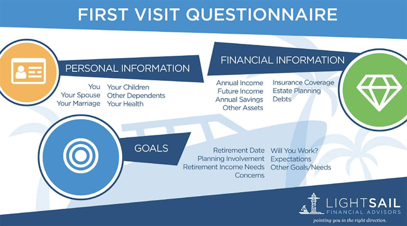
Any time you are trying to make a point through data, consider making an infographic. It’s much clearer and more digestible for consumers than a standard graph. And its eye-catching details actually capture a reader’s attention rather than making their eyes glaze over. Look at the sorts of graphs that litter advisor white papers. Many are line charts graphed on x-y axes, representing lots of different points. How is a layperson supposed to use that? Should they follow along with their finger? Check your math? What’s the takeaway supposed to be? Why would anyone abandon a reader to wander through a graph completely lost and wondering what it all means? Infographics turn that model completely upside down. If you notice, they very rarely use charts with x-y axes that require readers to figure them out. Instead, they tell a story.
Think about storytelling before you start compiling data. How will you lead your readers step by step to some sort of conclusion? What do you want them to think? How are you going to draw them in? What’s the “a-ha!” moment that you want them to experience? Spell it all out. And please, don’t make your infographic too big. You should use infographics to make one major point, not ten.

How—and where—to promote your infographic
Once you’ve created an infographic, it’s time to use it. First and foremost, you need to create visibility. Post it on your blog or home page—optimized for SEO with the right keywords, title tags, and meta description. Share it across social media. Attach it as an extra downloadable asset next to relevant stories on your site. Use it in as many places as you can. Don’t limit its use to digital, either. Infographics are a great way to connect your digital presence to your print collateral. Do you use those brochures or folders with pockets in the back? Instead of filling the pockets with super boring fact sheets, tuck in some of the same infographics you use online. It will help create an integrated brand presence and customer journey—and be more interesting to read.
Also, you aren’t limited to using the entire infographic as a single piece. If it’s large, you can get more bang for your buck by creating bite-sized snippets out of each component and using each one separately. Socialize these snackable bits online with a call to action to get the whole visual. Small graphics are also easy to share with your network, and you can encourage other people to share them as well.
Don’t overlook one of the best places to share infographics: your COIs. Send your infographic to your centers of influence. Ask whether it might be relevant to their businesses or useful for their own communications. It’s such a simple way to market to your COIs—something advisors should do much more often.
Be shareable
Of course, you need to make people actually want to share your infographic. As with advertising, the secret to making your infographic interesting is to make it relevant to your audience. Focus on their worries, their pain points, their interests. You don’t necessarily want to create an infographic on performance in emerging markets unless you want to be seen as a portfolio manager.
And please, don’t make the mistake of creating an infographic that’s interesting only to you. The industry loves infographics about itself. It likes beautiful pictures that show how the business is changing. Which technologies are taking off. What industry Millennials are killing this time. Please. That’s all inside baseball. Millennials don’t care how they’re affecting your life. They want to know how you’ll improve theirs.
I know some advisors like to share their perspectives on the business, feeling it gives them credibility within the industry. But once you lose credibility outside the industry, it’s gone. Once you release three infographics about CRM software, nobody is going to look at your next infographic about financially surviving divorce. It’s too late.
In my next post, I’m going to wrap up this series on contact marketing with an example of a checklist done right.